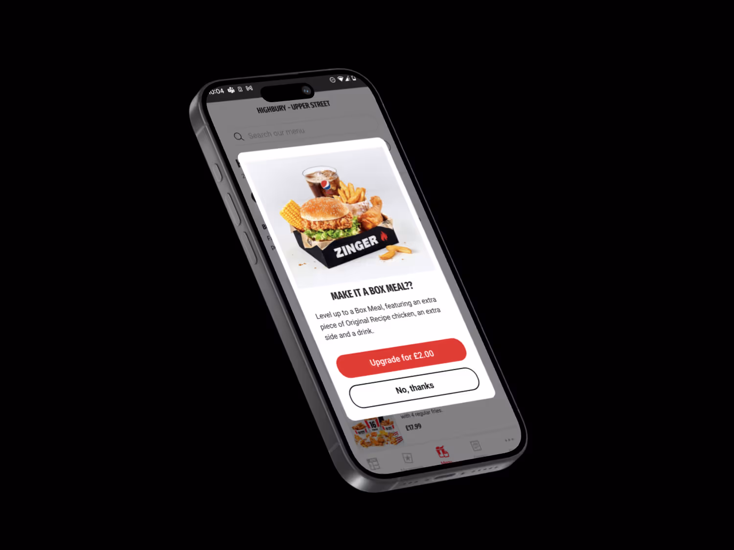
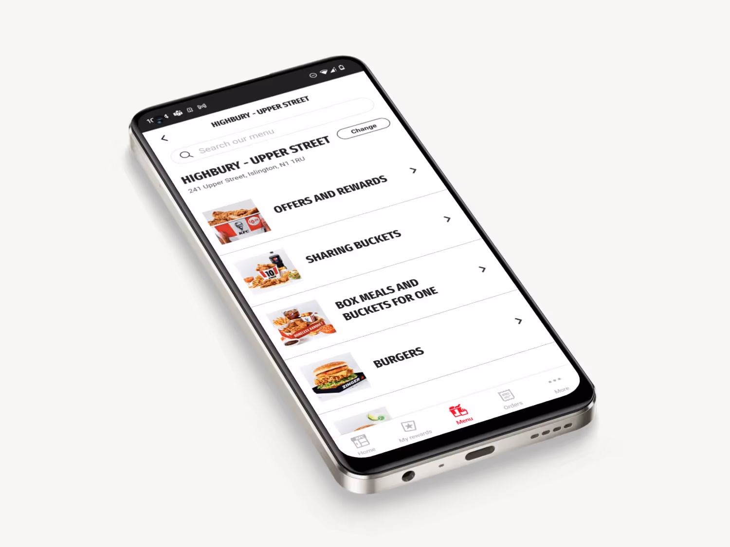
KFC

Redesigning KFC's menu browsing experience

Client
Adamas Data
Industry
Enterprise Technology
Year
2025
TOBY/CARPENTER led a redesign of the app’s menu experience — simplifying navigation, clarifying confusing product categories, and enhancing upsell performance. The result: a user-centred prototype that made browsing effortless and ordering faster.
The Problem
KFC’s app had become difficult to browse. With a complex mix of abstract product names, legacy categories, and a long-scrolling layout, users felt overwhelmed and often confused — especially when differentiating between similar offerings like Box Meals and Buckets for One. The upselling experience underperformed, and the structure lacked scalability. TOBY/CARPENTER was brought in to redesign the experience end-to-end.
The Solution
TOBY/CARPENTER began by conducting competitive usability testing against McDonald’s and Burger King to pinpoint friction points. A follow-up card sorting exercise revealed key insights into how customers mentally grouped products and what confused them. From this, a set of UX principles was formed to guide the redesign — including clearer nesting, combining overlapping categories, redesigning upsell modals, and using imagery to improve clarity. A Figma prototype was developed and validated through user testing, with significant performance gains across all key journeys.